Building a global brand architecture: Sub-brand identity & platform
Crafting a visual system to position a global sustainability leader’s new campaign.


The goal
A global woodfibre company needed a new brand narrative to better position its sustainability forestry practices and innovation. My task was to develop a cohesive visual identity for a new sub-brand and platform, ensuring it resonated with a diverse global audience while remaining grounded in the parent company’s heritage.
The Problem
We needed a visual identity that felt distinct and modern, yet instantly recognisable as part of the wider brand family. The challenge was to move beyond traditional corporate aesthetics and create a platform that felt human, tactile and purpose-driven.
The Solution
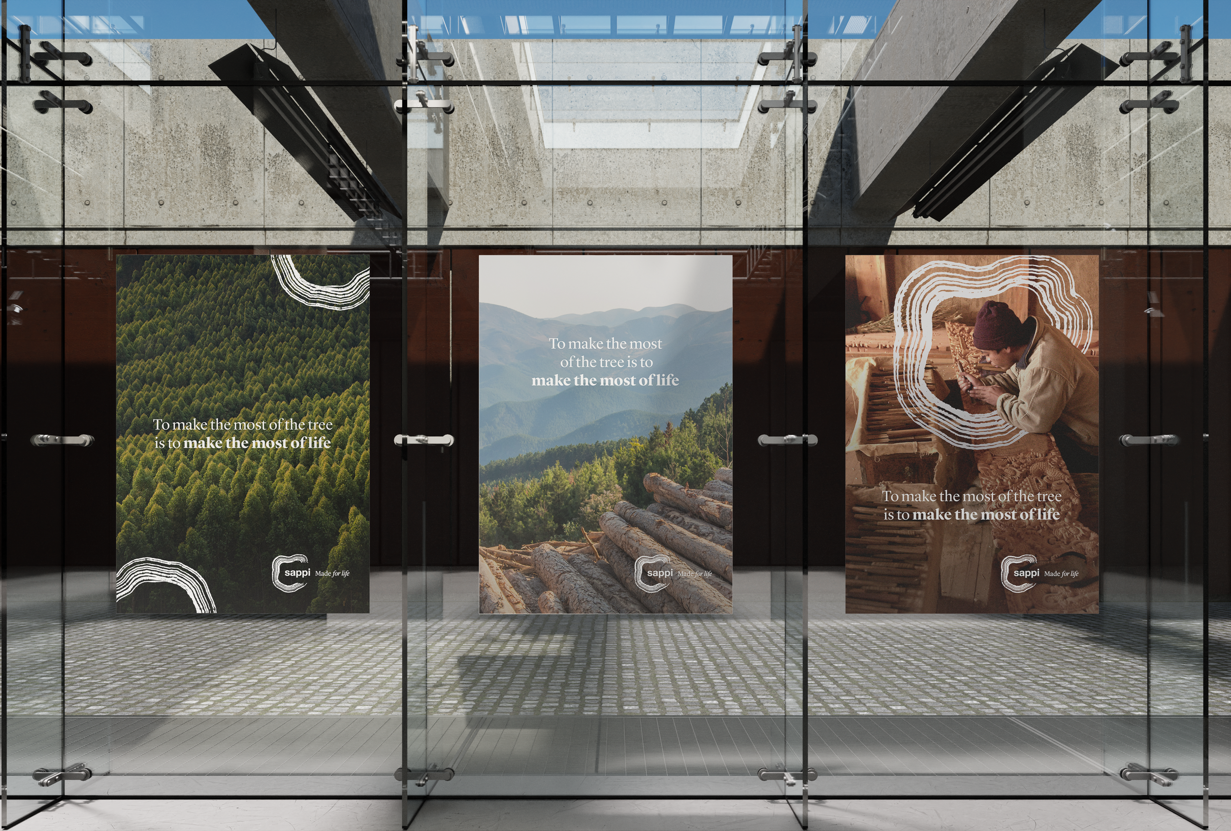
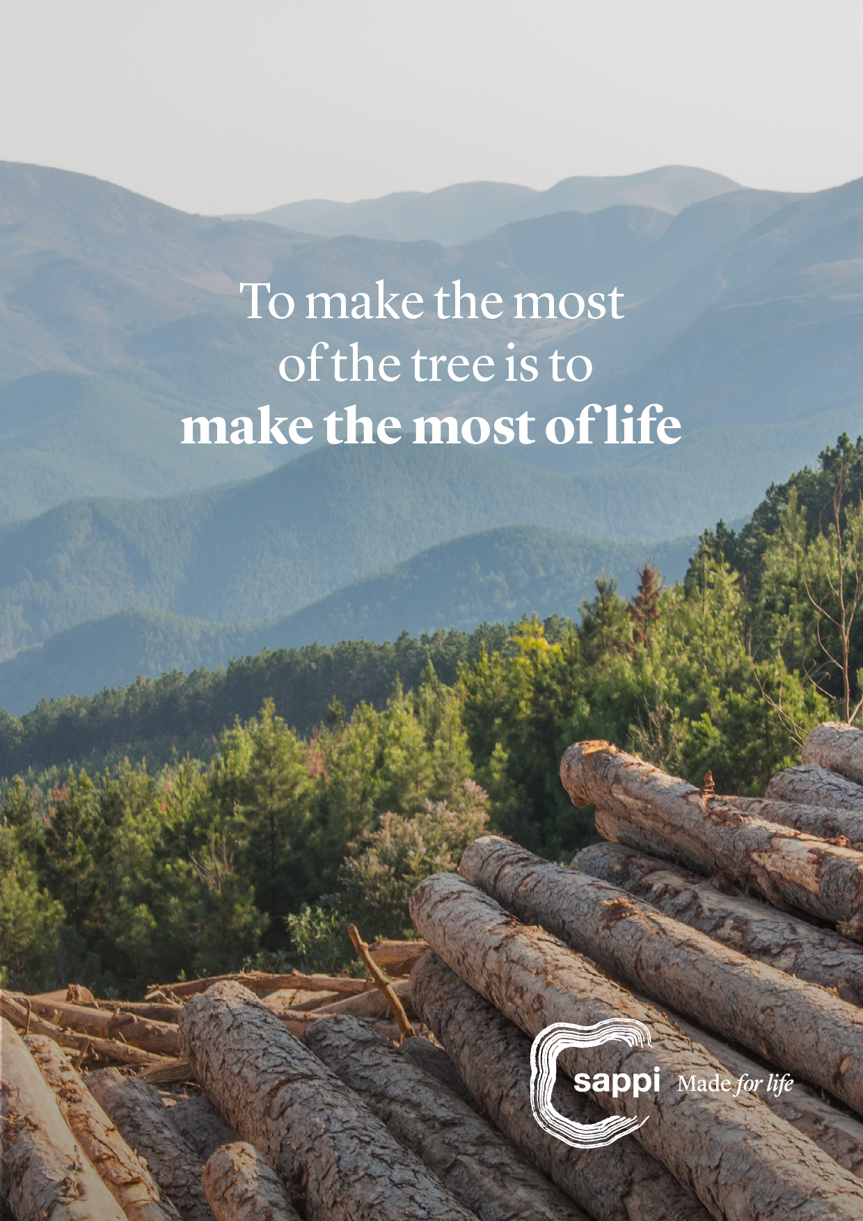
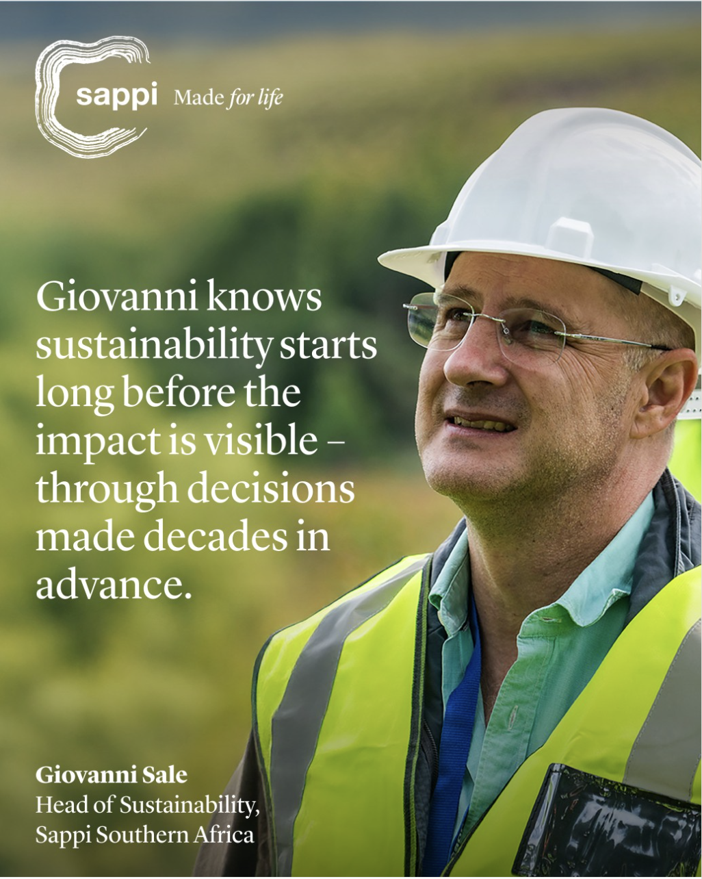
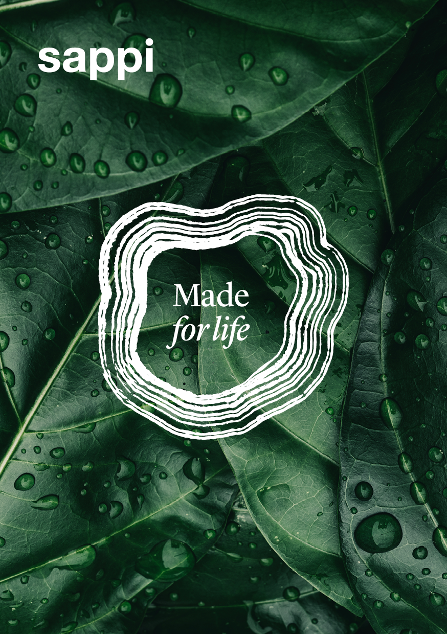
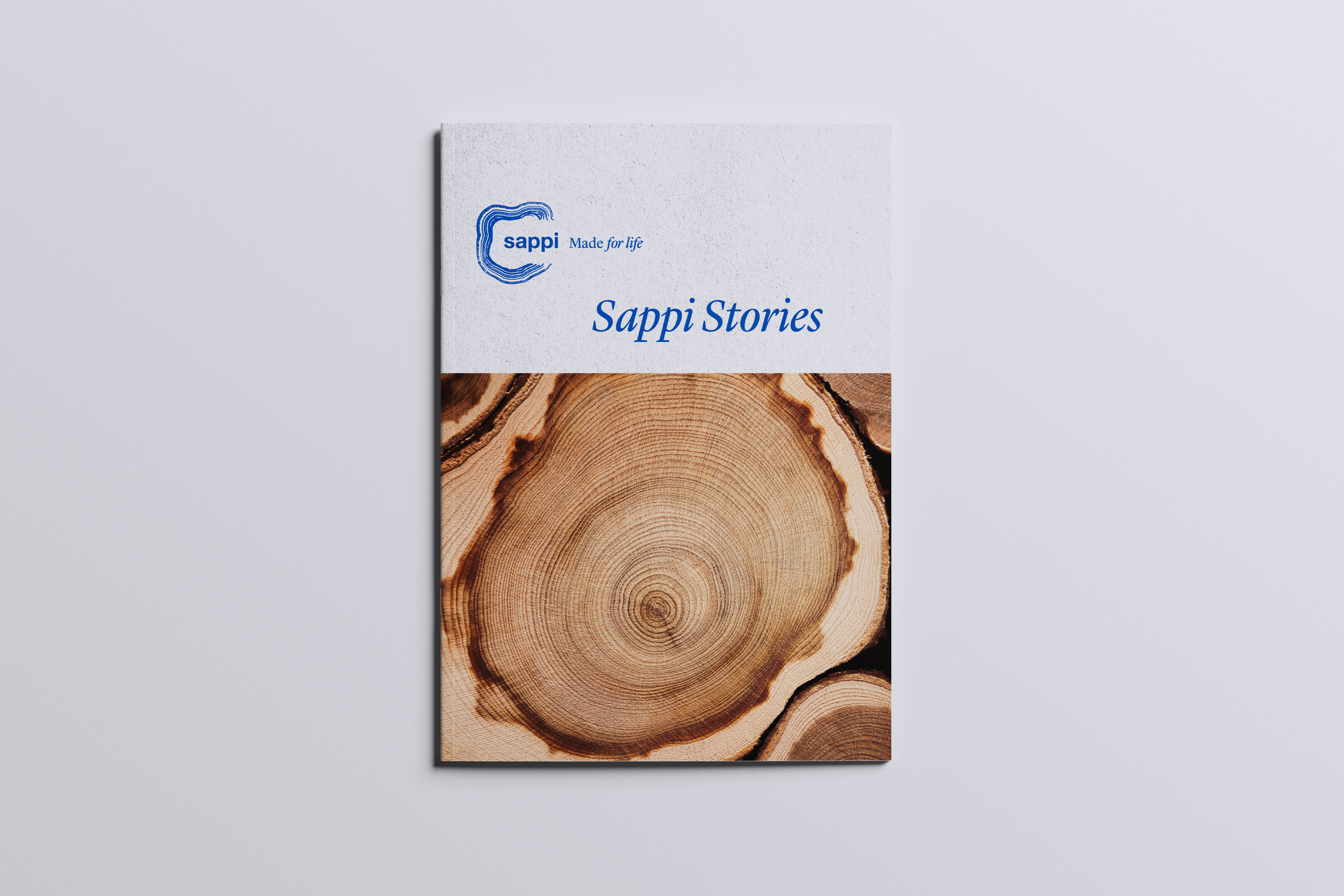
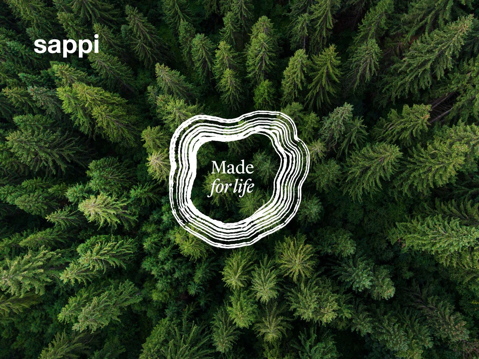
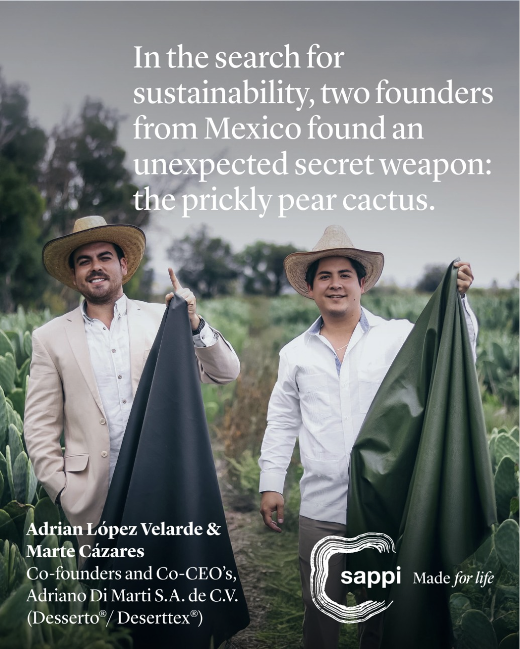
I served as the lead designer for the sub-brand, creating a new logo that intelligently integrated the parent mark with a bespoke “growth ring” graphic inspired by the cross-section of a tree. I established the photography style direction to ensure a consistent, authentic feel across the campaign. I also defined the design system for how this sub-brand would live across a wide variety of touchpoints – from printed materials like calendars and posters to web and social. By staying true to the parent company’s core typography and colour pallete, I ensured the new platform felt like a natural, elevated extension of the brand.
The Outcome
The campaign exceeded engagement and impression targets by over 200%. By creating a scalable and thoughtful visual identity, I provided the client with a robust brand system that seamlessly spans both physical and digital media, successfully grounding complex environmental narratives in a human and relatable visual language.